


OverviewKumi 🍎 is an innovative learning management system for lower-income middle and high schools. By including innovative learning technologies through a community-based platform, accounts for all the integral members of a lower-income community.
Timeline —July - September 2021 (9 weeks)
Role — Team Lead, Product Designer, and UX Researcher
Team — 3 designers, 3 product managers, 7 developers
Tools — Figma + Principle
my impact01
02
Designed, delivered, and conducted user testings of core features to the company within a tight timeframe
Through prioritizing user-centric features, my efforts led to the expansion and enhancement of Kumi’s user experience and expanded Kumi’s product offerings.
Established a responsive and scalable design system that could be used across multiple platforms, including web and iOS.
I crafted responsive and reusable components, buttons, and color schemes, ensuring consistency and efficiency across all platforms

Background2020 - 2021 has not been easy, especially for students and teachers 😪.
After the transition to online learning due to COVID-19, lower income schools have been impacted negatively largely due to not having a dedicated online platform for students. Due to lack of funds, these schools can not afford specific platforms like Blackboard or Canvas which resulted in the use of disparate tools like emails, Zoom, Microsoft Teams, etc to make up for this. However, these come with their own set of issues such as lack of personalization and technical difficulties.
😵💫
40% of secondary-school students lost all learning during transition to online.
❗️
50% of secondary-school students that had access to online learning experienced “poor quality” learning.
problemLack of personalizable and streamlined platform during COVID-19 caused an overwhelming, disengaging, and disconnected learning experience.
outcomeA online platform that offers teachers and students a learning management system to engage in a virtual educational experience that bridges the gap between online and offline learning.
COMPETITIVE ANALYSISAnalyzing Existing Learning Management Systems (LMS)
To establish a solid foundation for our LMS, we started by thoroughly exploring the existing user experience of two apps: Blackboard and Canvas, we also referenced a few other LMS like Google Classroom and Schoology to gain insights into the strengths and weaknesses of each LMS and to see what works well and what doesn't in similar offerings.

TRANSFORMING USER INSIGHTS AND RESEARCH INTO PRODUCT GOALSIn order to design a new LMS, our team gathered user research data from our partnered school to further understand the stakeholders and users’ needs. We found out that a lot of LMS systems and users feel that they currently lack personalization to users and the school, visual cues to help guide students, helpful integrations, and digestible content.
🤔❓
“How might we provide personalized experiences for students, while incorporating intuitive visual cues to aid student navigation, seamless integrations for enhanced functionality, and easily digestible content?”
Provide a personalized experience so the platform also serves as a personal productivity tool for students
😁 Digestible Content
Avoid cognitive overload and only display necessary content to prevent users from feeling overwhelmed
👀 Visual Cues
Product goals🎨 Personalization
Offer visual affordances and assistance to help users focus and complete a task in a more timely manner
🗓 Google Calendar Integration
Allow users to integrate their tasks, assignments, schedule, and deadlines to better plan their schedule more efficiently
working with the teamIteration & Collaboration
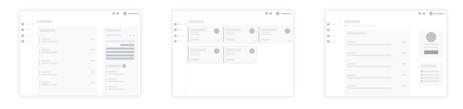

The design team and I iterated on low-fi prototypes and tested them quickly with users, stakeholders, and developers to hash out how the flows should work. Once we worked out the high level overview, I took over the final details of the design. We iterated over the details together with the team and presented them to the stakeholders and engineers, explaining our new design decisions. The following are the low to mid level design iterations with feedback my design team and I went through.

[FIG 01] courses page EXPLORATIONS (LEFT) VS. FINAL (RIGHT)
[FIG 02] secondary navigation EXPLORATIONS (LEFT) VS. FINAL (RIGHT)SOLUTION
Here are our current final designs! 💥
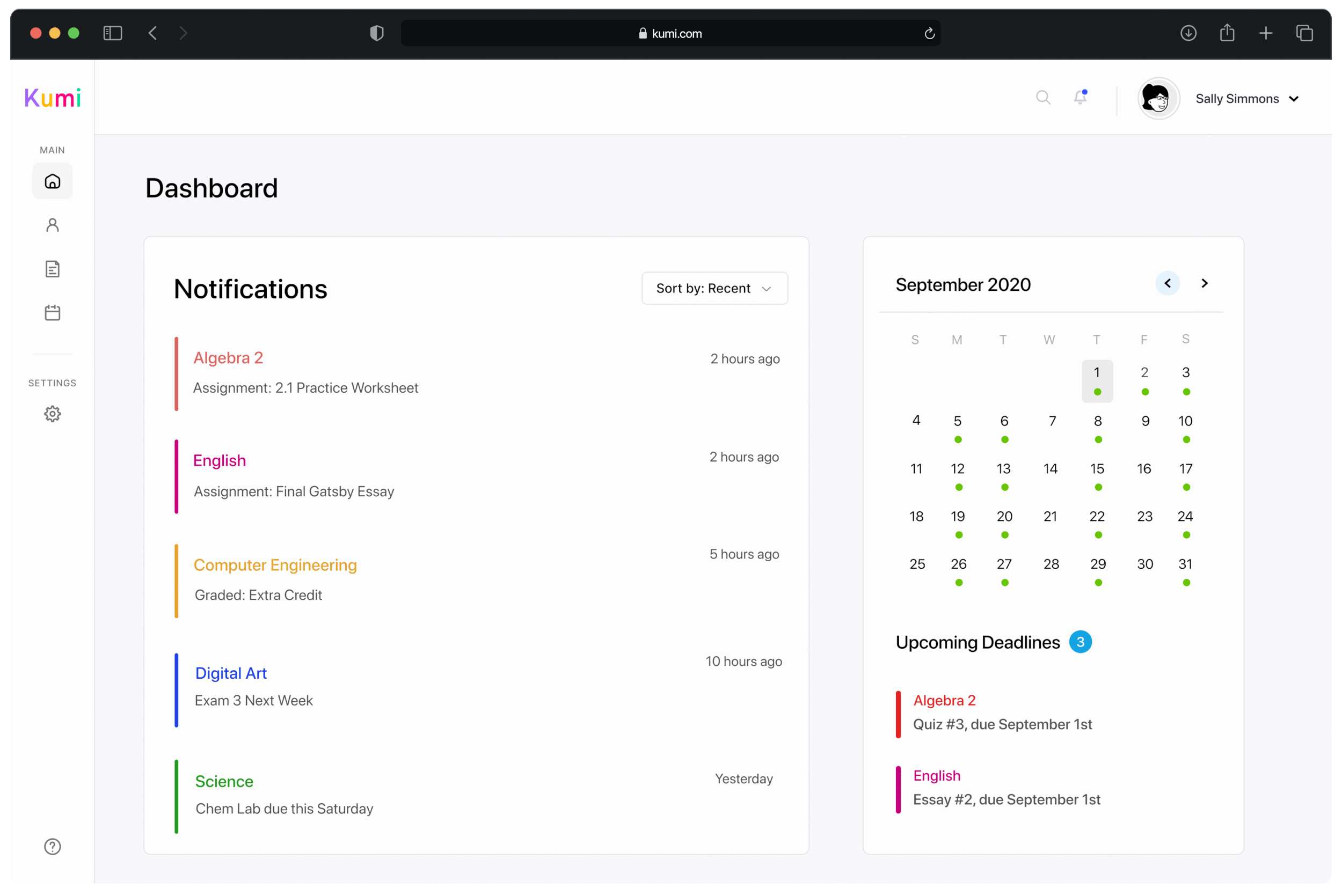
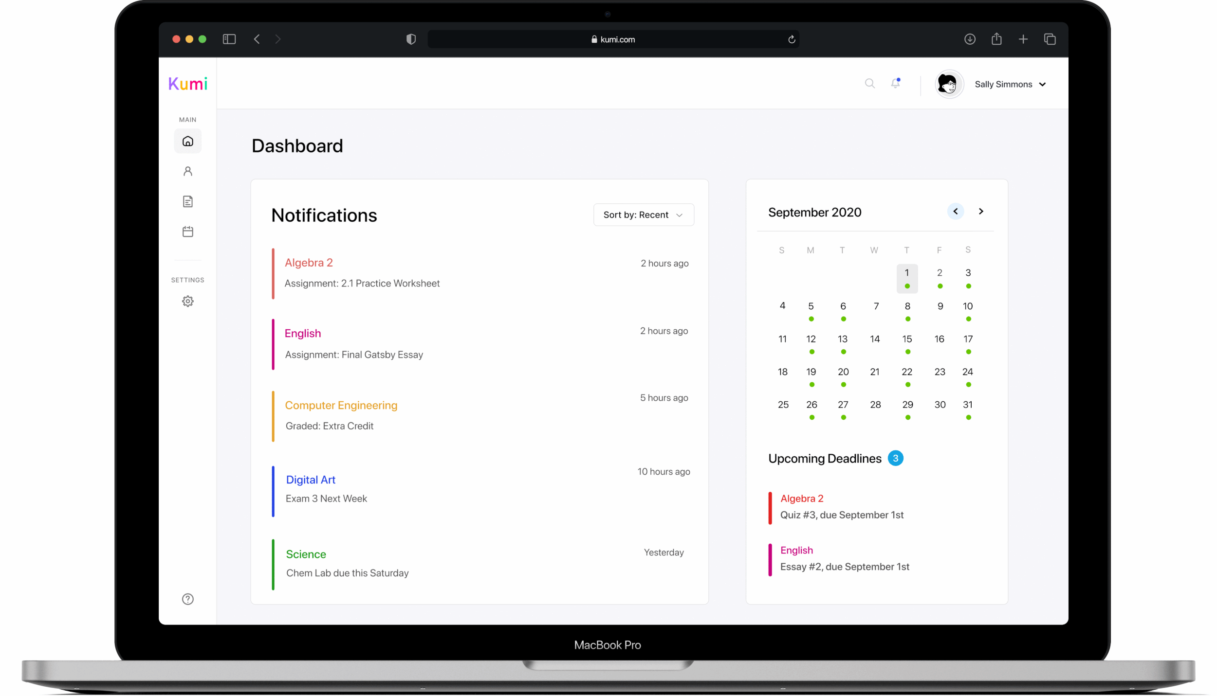
Kumi gives students control and personalizable options on how they want to view their dashboards, courses, and calendar. Students are also given the option to integrate their gcal into Kumi and have it sync with their calendar on Kumi (assignments’ due dates, test/quizzes, and more).
streamlined & seamless user experience 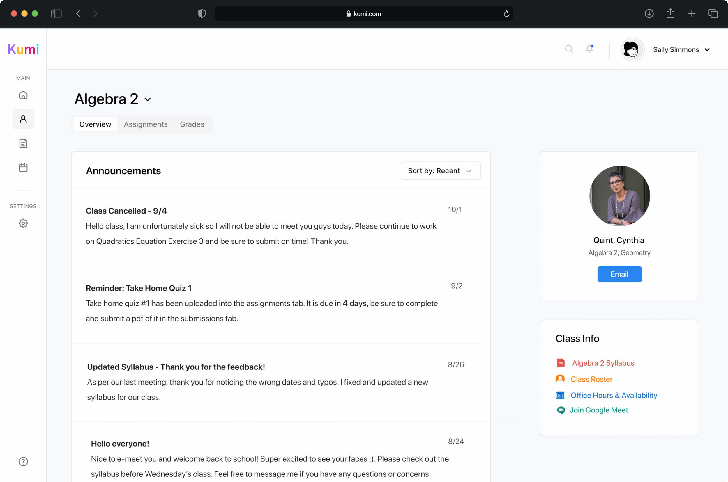
Students can easily access a comprehensive course overview, featuring instructor contact details and crucial information like syllabus, office hours, and class roster, consolidated onto a single page, eliminating friction. Additionally, Kumi’s seamless navigation enables users to easily transition to specific course assignments (submissions/homework), and grades with minimal effort.
*Designs are subject to change due to our partnered schools revamped branding and future developments with the team.
Personalized experiences visual clarity to enhance user engagement and comprehension
Kumi provides intuitive visual signifiers, color coded lablels, and icons to help users going through the learning process more easily and effectively.
Next StepsPhase 1 Completed! 😎 ✅
REFLECTION: LEARNINGS & IMPROVEMENT