

OverviewJitto 📦 is a B2B startup that aims to empower independent retailers and increase efficiency by digitizing manual, human error-prone and time consuming tasks. Their current user experience has multiple usability issues, lacks transparency, and has dated user interface.
Timeline —July 2023 (4 - 5 weeks)
Role — Product Design Intern, Team Lead
Team — 3 UX designers, 1 product manager, 2 software engineers
skills — Figma, interface design, prototyping, copywriting


SUMMARYNewly redesigned pages for better accessibility, improved user experience, and enhanced transparency, enabling users to efficiently navigate Jitto.
As the lead designer of Jitto, I designed a new login page, dashboard, catalog page, and order history page for Jitto. I made key actions more discoverable and accessible, improved and maintained visual consistency throughout several pages, and enhanced transparency so Jitto’s users are able to complete tasks more efficiently.
THE ProblemOld login and cart page
It’s difficult for users to seamlessly and intuitively navigate through Jitto.

The current user experience for Jitto’s users is dated, lacks transparency, and features an inconsistent user interface. Poor transparency and multiple usability issues significantly hinder Jitto’s user experience, leading to decreased conversion rates and user retention.
Desgin GOALsDesigning an accessible and functional dashboard and website
It’s important to design a positive first impression and build trust immediately upon onboarding. Enhancing transparency and accessibility in key functions will help users complete tasks more efficiently and foster a seamless user experience.
💬 Enchanced Transparency
How might we enhance transparency and provide better visibility to users?
✨ Unified experience
How might we create a visually appealing and consistent user interface that aligns with the entire platform?
🔍 Improved Efficiency
How might we streamline and optimize workflows to increase efficiency for independent grocers?
🥳 Seamless Interactions
How might we improve the discoverability and navigation of features within the platform?
DESIGN AUDIT Competitors utilize intuitive information architecture, information transparency, and cohesive design systems to deliver an efficient, transparent, and user-friendly platform experience.
My design audit of multiple B2B, SaaS, and e-commerce dashboards revealed that competitors have intuitive information architecture, clear navigation patterns, and cohesive visual design systems that promote discoverability while streamlining workflows through seamless integrations, enabling users to easily navigate and efficiently complete tasks. These insights served as a source of inspiration when redesigning the interface of Jitto.

Old login and cart page
Exploring features and Iterations
iterations
Throughout the iterative design process of my team, multiple changes were made. The central focus across all feedback sessions consistently emphasized preserving the simplicity of the user experience and usability of the core functions, spanning from hierarchy to visual design.
An important feature for Jitto was being able to purchase products via the catalog page. Therefore, we spent a lot of time iterating with diverse possibilities and narrowing down to one iteration that balanced both efficiency and information without overwhelming the users.
[FIG 02] item card EXPLORATIONS (LEFT) VS. FINAL (RIGHT)
[FIG 03] order history chart: EXPLORATIONS (LEFT) VS. FINAL (RIGHT)
[FIG 04] catalog nav bar: EXPLORATIONS (LEFT) VS. FINAL (RIGHT)
[FIG 01] dashboard explorations (LEFT) VS. FINAL (RIGHT)
Final ExperienceJitto's redesign streamlines grocery operations through transparency via comprehensive real-time information, intuitive feature discoverability, optimized efficient workflows, and a cohesive user-friendly interface.
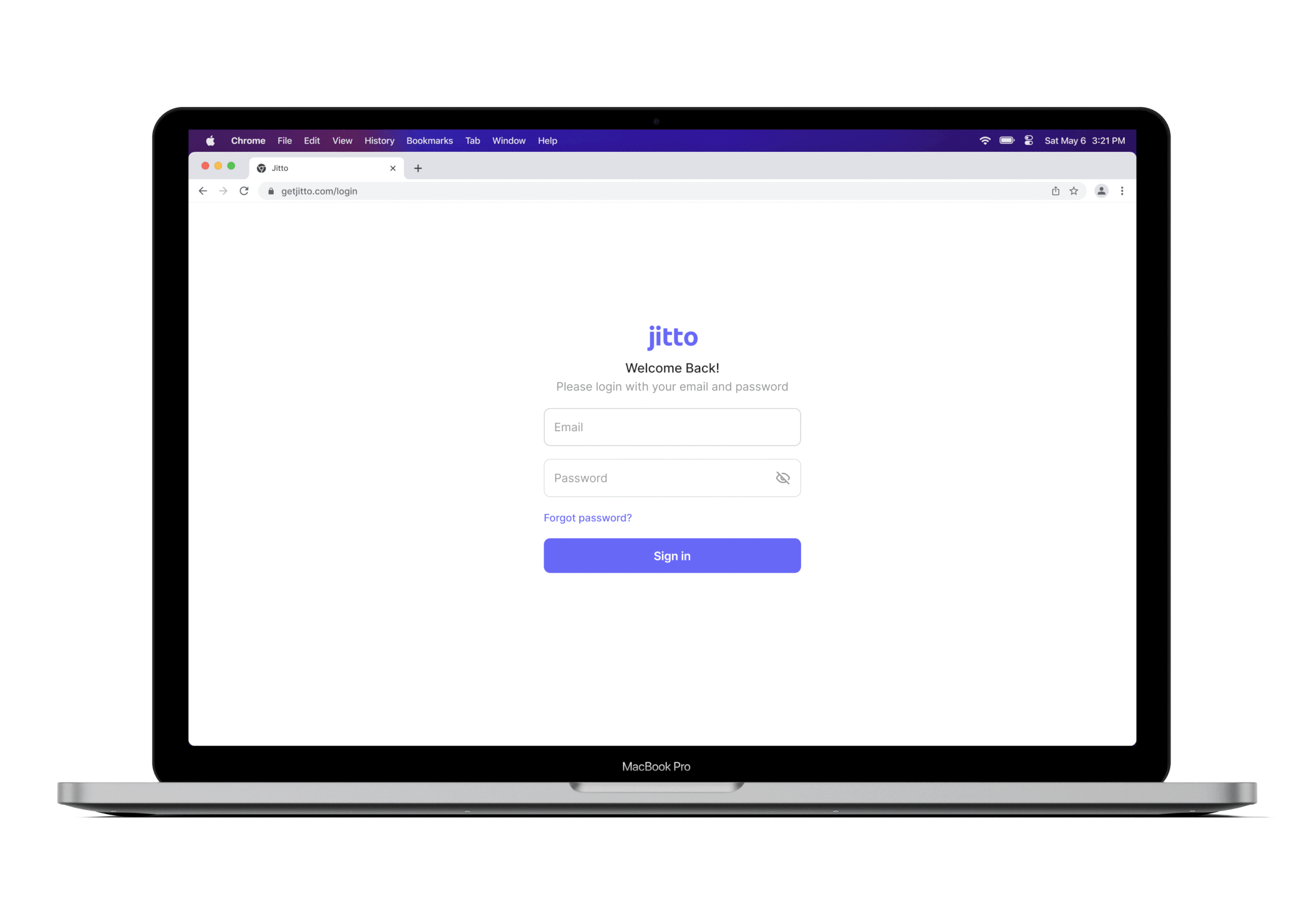
Newly designed functional login page where users login to Jitto with updated UI.
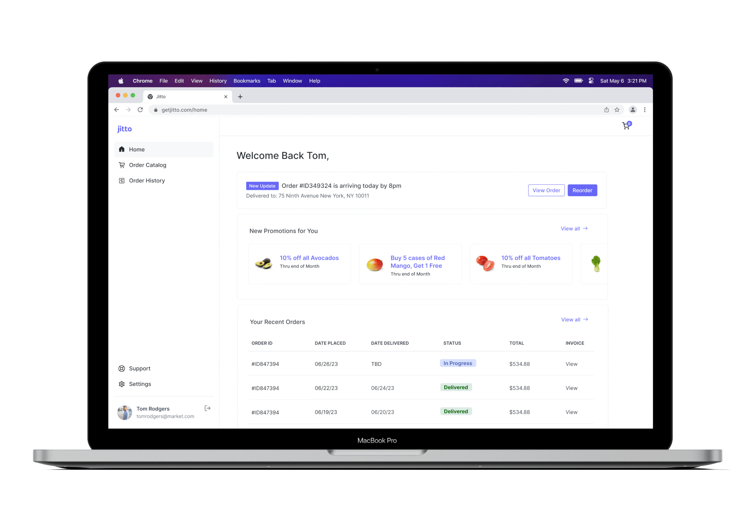
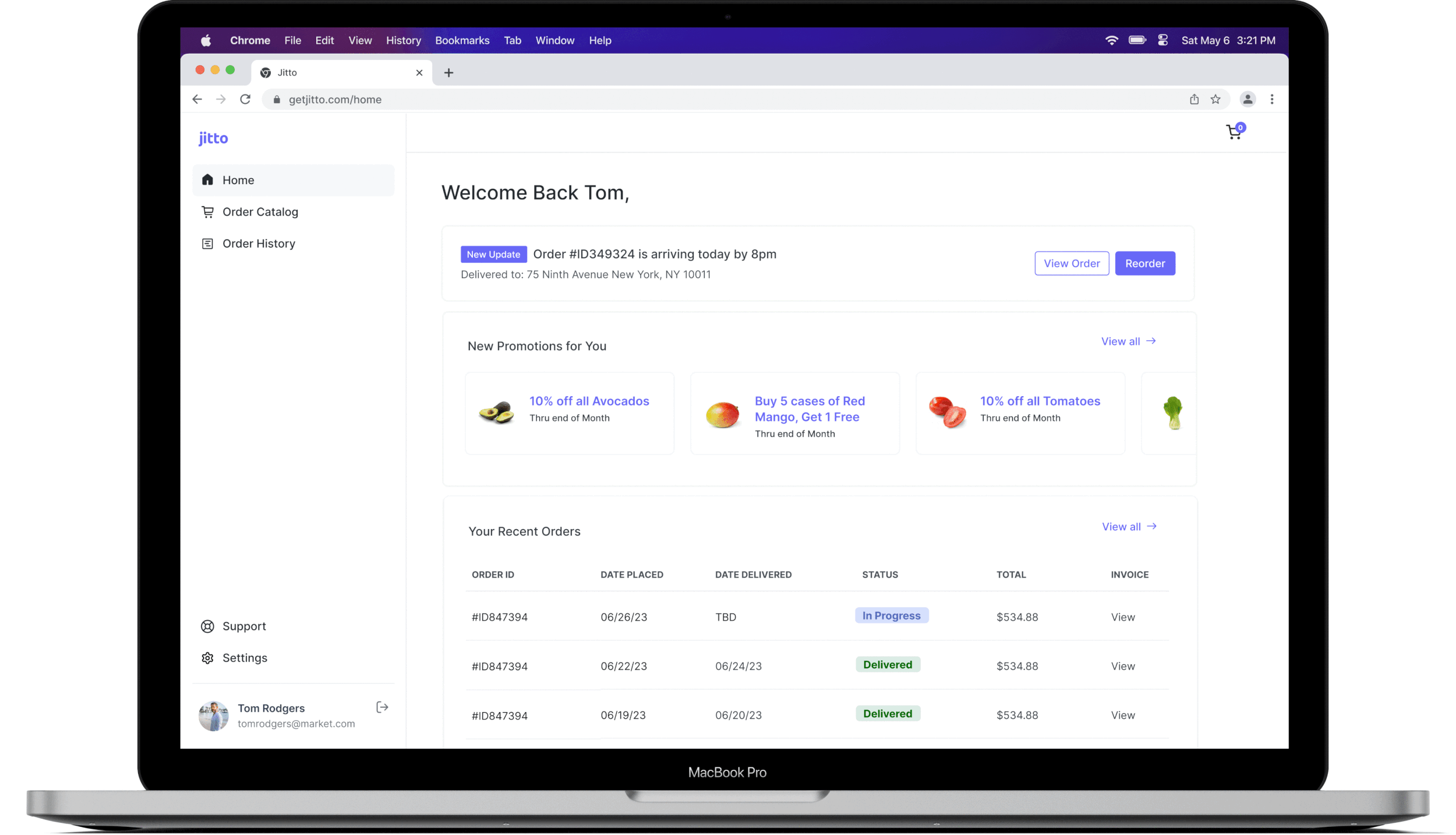
Dashboard/Home
This is where users get an overview of their lifetime purchases, new weekly promotions, top products, and recent orders. They’re also able reorder their most recent order and track it.
Login page
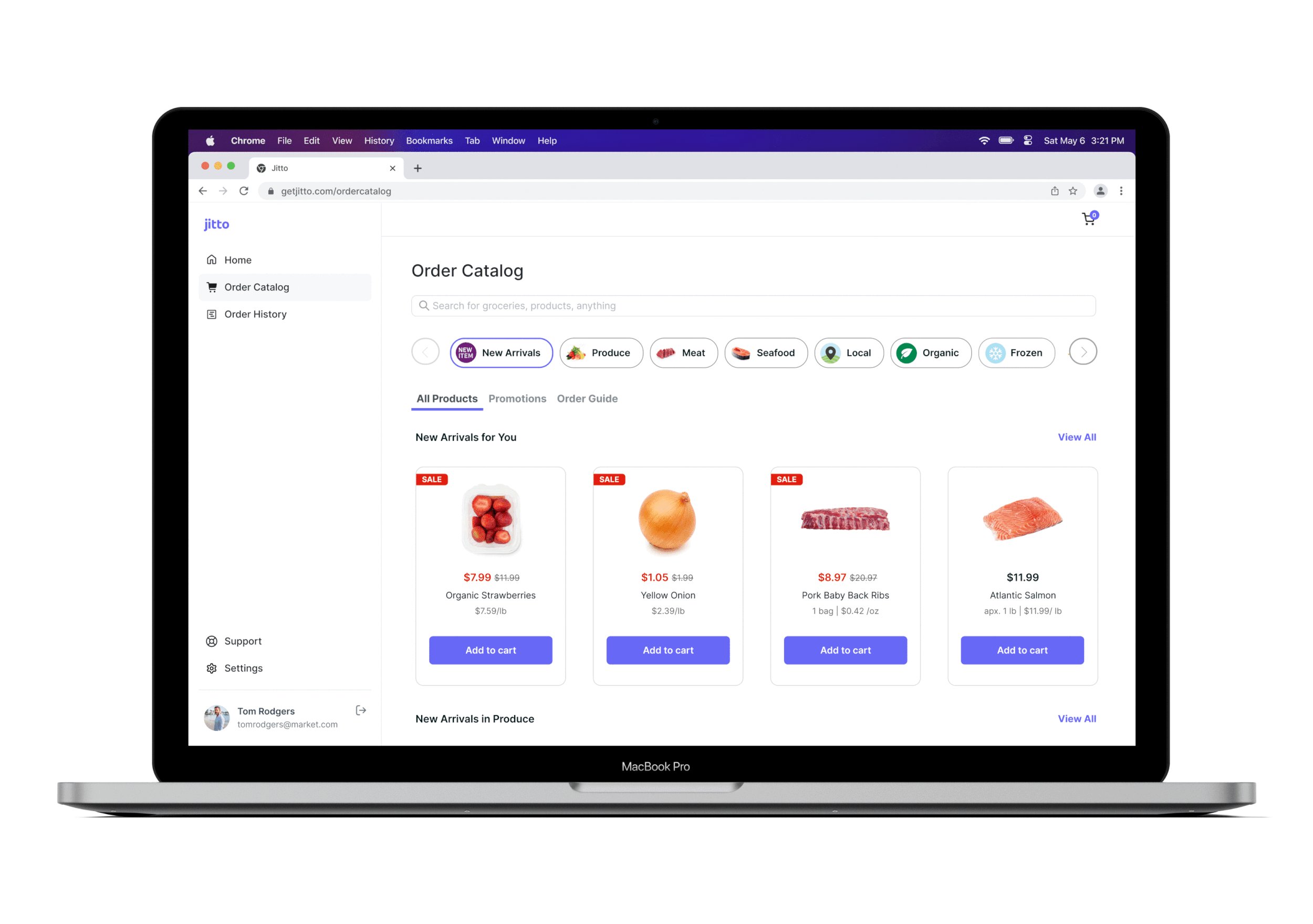
Order Catalog
This is where users are able to shop and search for products they want to purchase.
They will also be able to view promotions and order guide on this page.
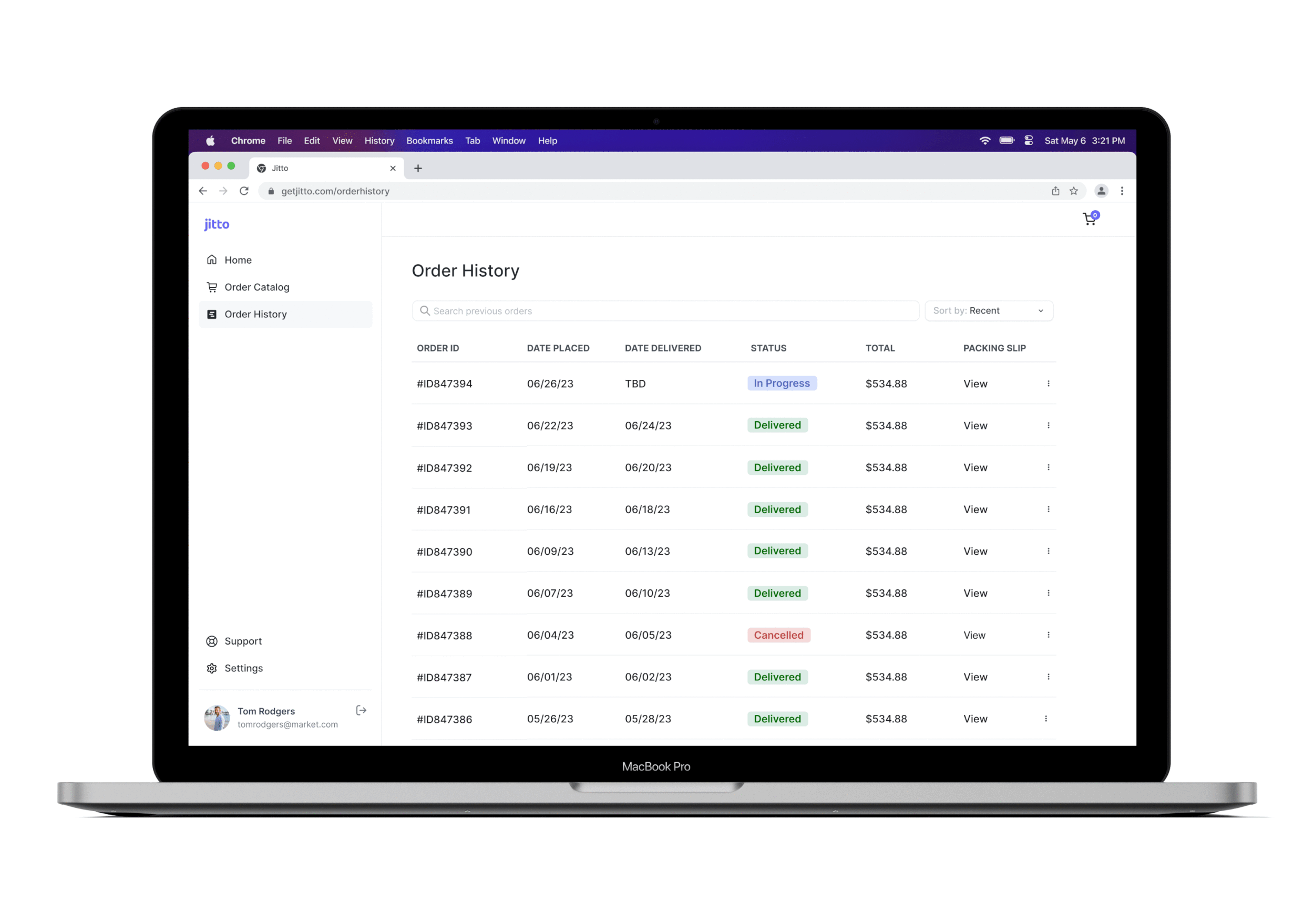
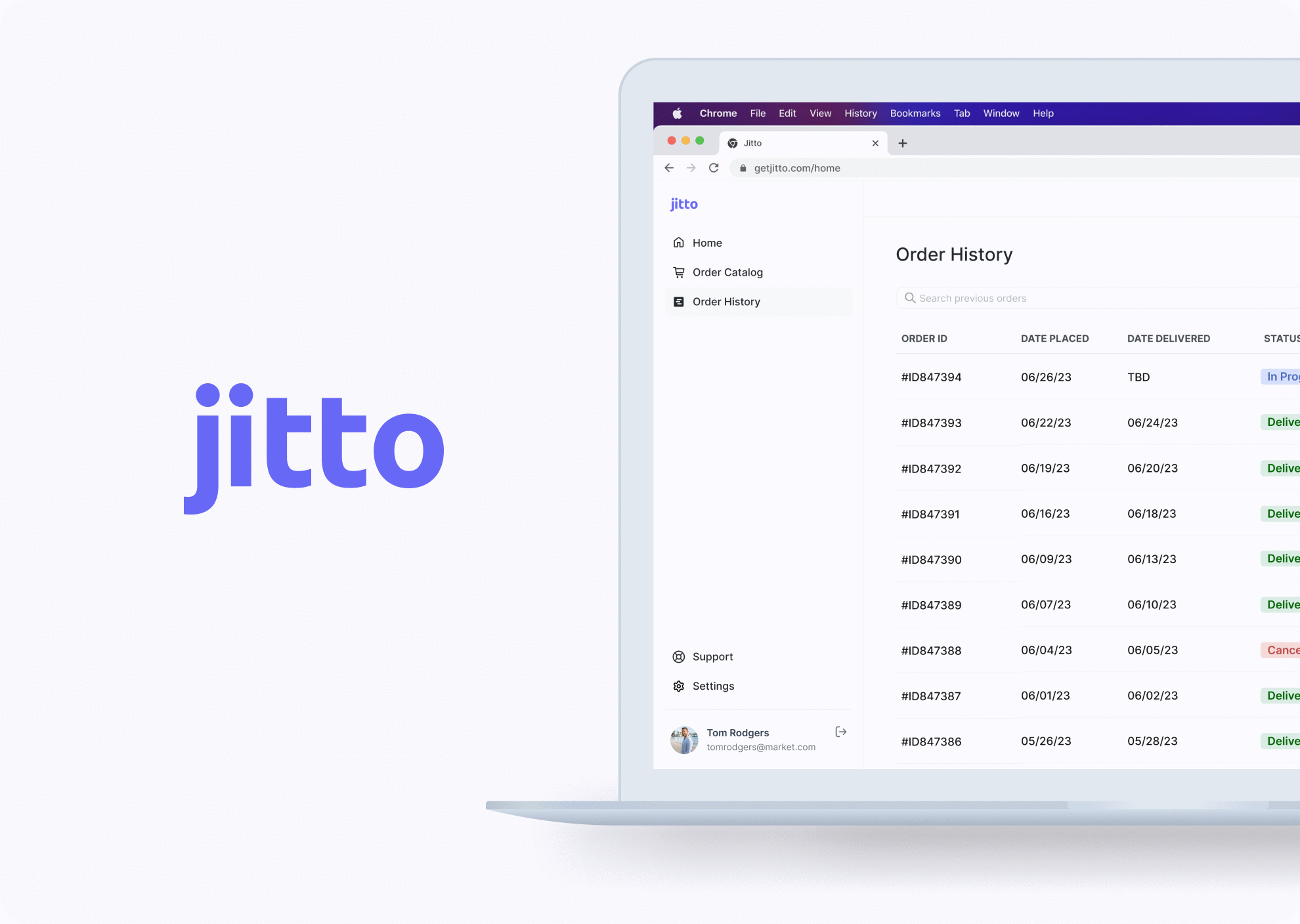
Order History
The order history page allows users to view their previous and recent purchases and the status of each order.
The user can also view specific orders and be able to reorder/cancel orders which will then be updated on the order history page.
Design System
SUMMARY & REFLECTIONIf I had more time 🧐…
What I learned 🤓
User testing Conduct user testing to ensure sure the platform is as smooth and intuitive as possible.
Next stepsMobile app exploration - have the platform be available on the go! Implement customizations and support page, and onboard new users.
Be open to feedback